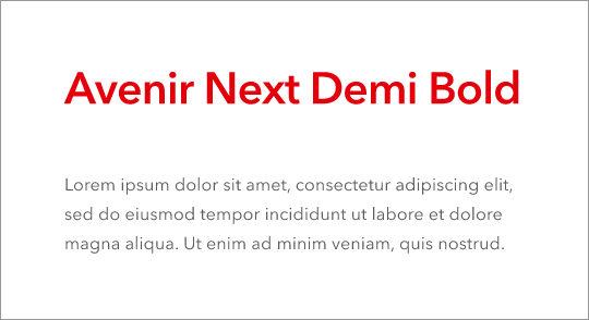
The corporate typeface is the visible language in which a company communicates. It is like handwriting you can recognise someone by. The use of typography manifests the uniqueness of a company, and the corporate typeface set makes an important contribution to this.
The new DEHN look is characterised by Avenir Next. It reflects the interplay between the familiar and the progressive. Its harmonious and highly readable typeface does not override the information to be conveyed. Special design decisions and the comparatively large x-height of the lowercase letters make Avenir Next appear new and fresh when used in headlines. It is very well formed and offers the right basis for all purposes.
Avenir Next is our new typeface for use in brand communication only.
For all other applications, we will continue to use the Segoe UI font.

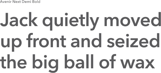
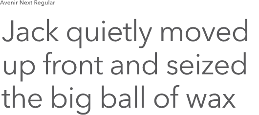

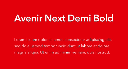
The defined colours for the typography are Text Grey and Eerie Black. Real White is also used on darker full-colour backgrounds. We should always ensure good legibility and a sufficient contrast ratio when using colours. In special cases, DEHN red may be used for headings and highlighting.


All our rules naturally also apply on the web. Details on the application can be found at paragraphs and headings.
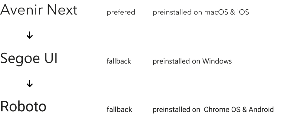
As there should always be a fallback defined, for systems that don’t allow font loading, or in the case something went wrong with the provision of the font, there are prefered fallback fonts on every major platform and eco system.
@font-face {
    font-family: 'Avenir Next';
    font-display: swap;
    src: url(/themes/custom/dehn/fonts/dehn21/avenir-default/AvenirNext-Regular.woff2);
    font-weight: 400;
    font-style: normal;
}

@font-face {
    font-family: 'Avenir Next';
    font-display: swap;
    src: url(/themes/custom/dehn/fonts/dehn21/avenir-default/AvenirNext-Demi.woff2);
    font-weight: 600;
    font-style: normal;
}
body {
    font-family: 'Avenir Next', 'Segoe UI', Roboto, sans-serif;
    font-weight: 400;
    font-size: 1rem;
    line-height: 1.5rem;
}